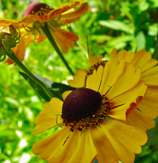
 Kat's blog Exploring with a Camera has me thinking about the square format for photographs. She suggested we look through our archives to find some photos that might work better in a square. It was interesting to me that most of my images pleased me in a 2:3 ratio or somewhere near to that. But there were a few that I think benefit from cropping into the square format.
This one for example had another flower on the right that was a distraction. I like the diagonal effect that comes out when that part is cropped.
Same thing with this one, the most interesting part of this image was the part on the left of the original photo. By making it square I cropped out some of the more boring leaves. Again there's some interest by the curving line of ice at the top.
This one is pleases me a lot. I snatched this photo in passing and liked the expression of the woman heaving her bolts of fabric around. It's not well focused and it really didn't work before I cropped the rest of the palapa and the background from the right hand side. Now I feel the subject is clear, and again there are some diagonals that work to keep it from being static.
You can follow Exploring with a Camera by clicking on the button at the top of the sidebar. Others have posted their explorations with the square format there as well.
Now it's off to work for me.


I like doing square for a change sometimes. The leaf photo looks like modern art.
ReplyDeletethe leaf photo is outstanding! steven
ReplyDeleteWonderful use of square format! Thanks so much for also including the explanations of what you removed and why the square format makes it better. I love them all! Thanks for linking in to Exploring with a Camera.
ReplyDeleteLove your square format. Nice photos.
ReplyDelete