In my case, I often work with the paper turned in different directions and without a horizon line or a roof or a head that's being referenced, the decision becomes purely aesthetic. Here's the little square painting turned each possible way. And to me they don't all look the same.


1 2


3 4
To me, numbers 1 and 2 look more architectural. One is like a building with a chimney and 2 is like a strong arch. In number 3 my attention goes more to yellow stripe along the bottom and its echo above, and in number 4 I see more the the brown area in the centre.
Now here's another example and it gets even more complicated when you're working with two paintings. These two are on panels sized 1 by 3 feet. I painted them separately but used similar colours. When I'd finished I realized that the two pieces actually can have a conversation between them. Although I'd painted them with a horizontal orientation, I decided to hang them vertically, and close enough together that they could be seen together and have some interaction.
Intuitively I placed the panels so the eye would travel across the grey at the top of the painting on the LHS to the same grey at the top of the painting on the RHS, and the white lines move across the centre of both pieces.
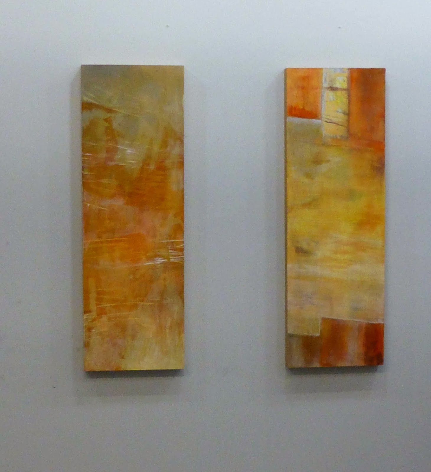
But when Bill Porteous looked at them together he had me turn the one on the right 180 degrees.
This is what they look like with this change. I actually think he's right, that this orientation makes them visually more interesting. What do you think?


I think Bill's advice is right on that one on the right.
ReplyDeleteI also think he is right,
ReplyDeleteThe painting on the right has such a strong double brown shapes on the top that I think your eye tries to make it walls or a door. Now when you turn it over you lose that relationship. You do still get that structure in the painting but it is not as strong and lets your eye flow. I really like what your doing and your colors seem to have life.
Just my opinion.
It sounds like your having a wonderful time in your painting class.
cheers, parsnip
Yes I really am Parsnip. Thanks.
ReplyDeleteHola, Joanna.
ReplyDeleteI actually think that the first orientation is much better. In the second, the "steps" in the right hand painting at the top take my eye away from your paintings. When it is flipped 180 degrees, the "steps" lead me back to the painting on the left. Hope all is going well with you. Peggy
You make a good point Peggy. This was part of my intuitive placing of it. We are well and looking forward to our move.
Delete